Quality Advisor
A free online reference for statistical process control, process capability analysis, measurement systems analysis,
control chart interpretation, and other quality metrics.

SPC DEMO
Don’t miss out! Book a demo of our specialized SPC software and unlock immediate improvements in your processes.
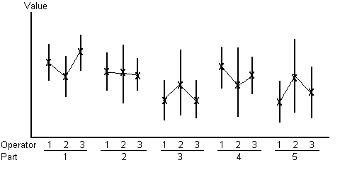
Whiskers plot
This chart shows the high and low data values and the averages by part and by appraiser. The vertical line represents the range deviation made by an appraiser on one part. This helps determine measurement consistency by an appraiser, across appraisers, and shows abnormal readings, and part appraiser interaction.
To create a Whisker plot:
- Plot the high and low data values and the average by part for each operator.
- Draw a line to connect the high value to the low value.
- Connect the averages for each part for each operator, as shown below.
The longer the line, the larger the deviation from the true value of each part. The Whisker-Box Plot also lets you compare the results of each operator. If one operator’s results vary greatly, the operator may need more training on the measurement techniques and practices.